- All
- Earth
- Venus
- Mantle convection
- Tectonics
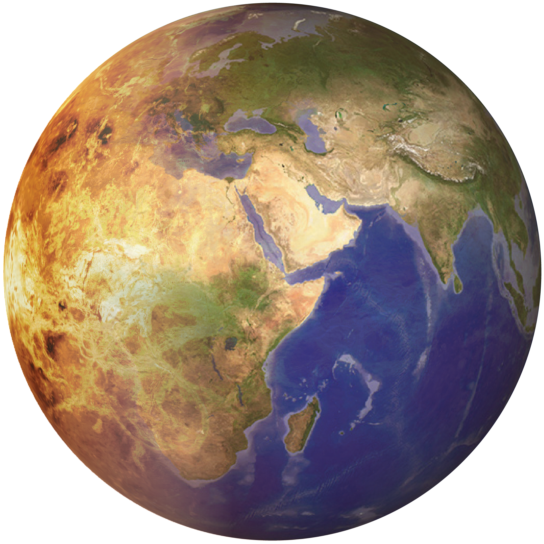
Venus to Earth transition globe
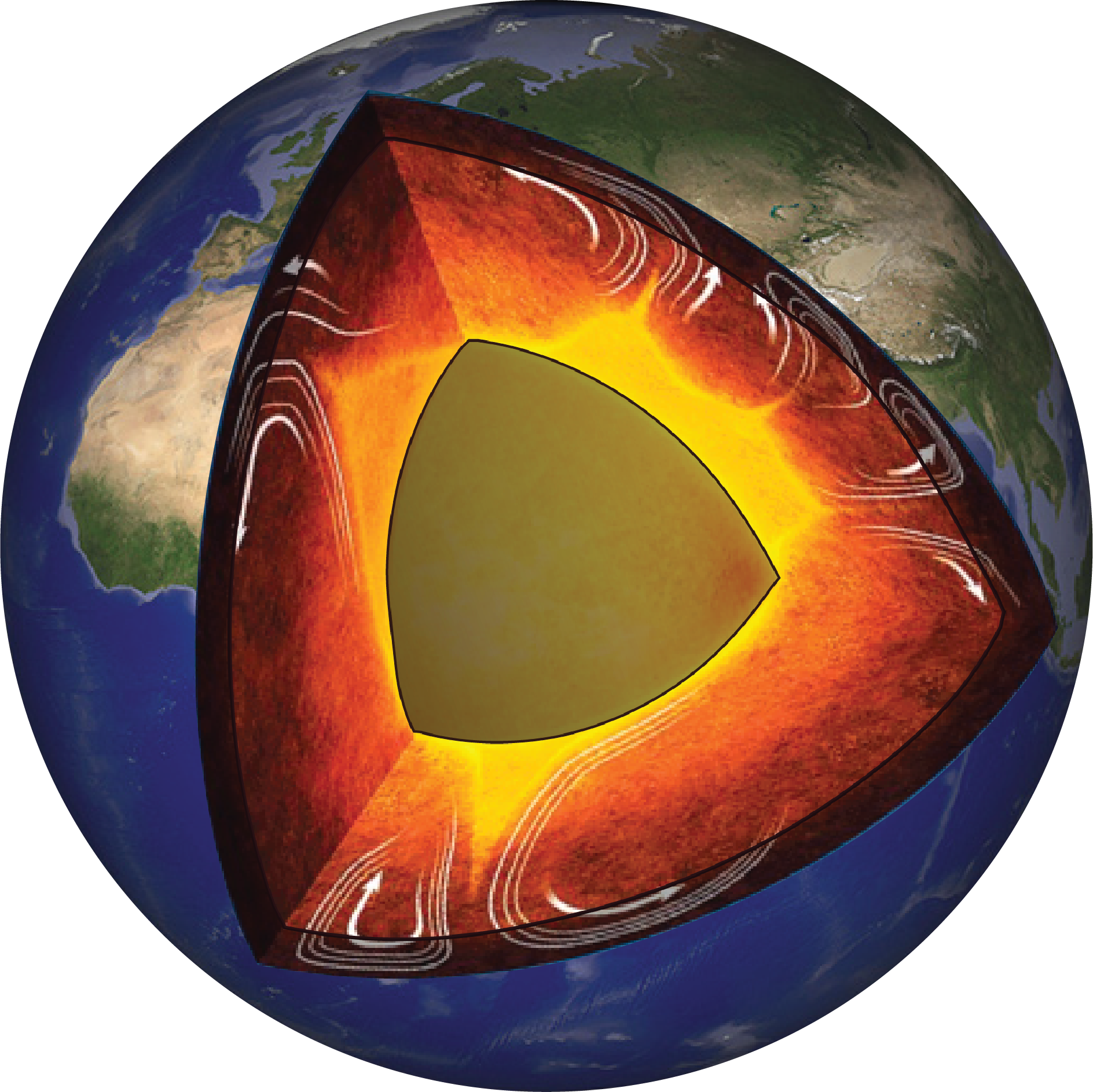
Earth globe mantle convection
Distinction made between upper mantle (dark colours) and lower mantle (light colours)
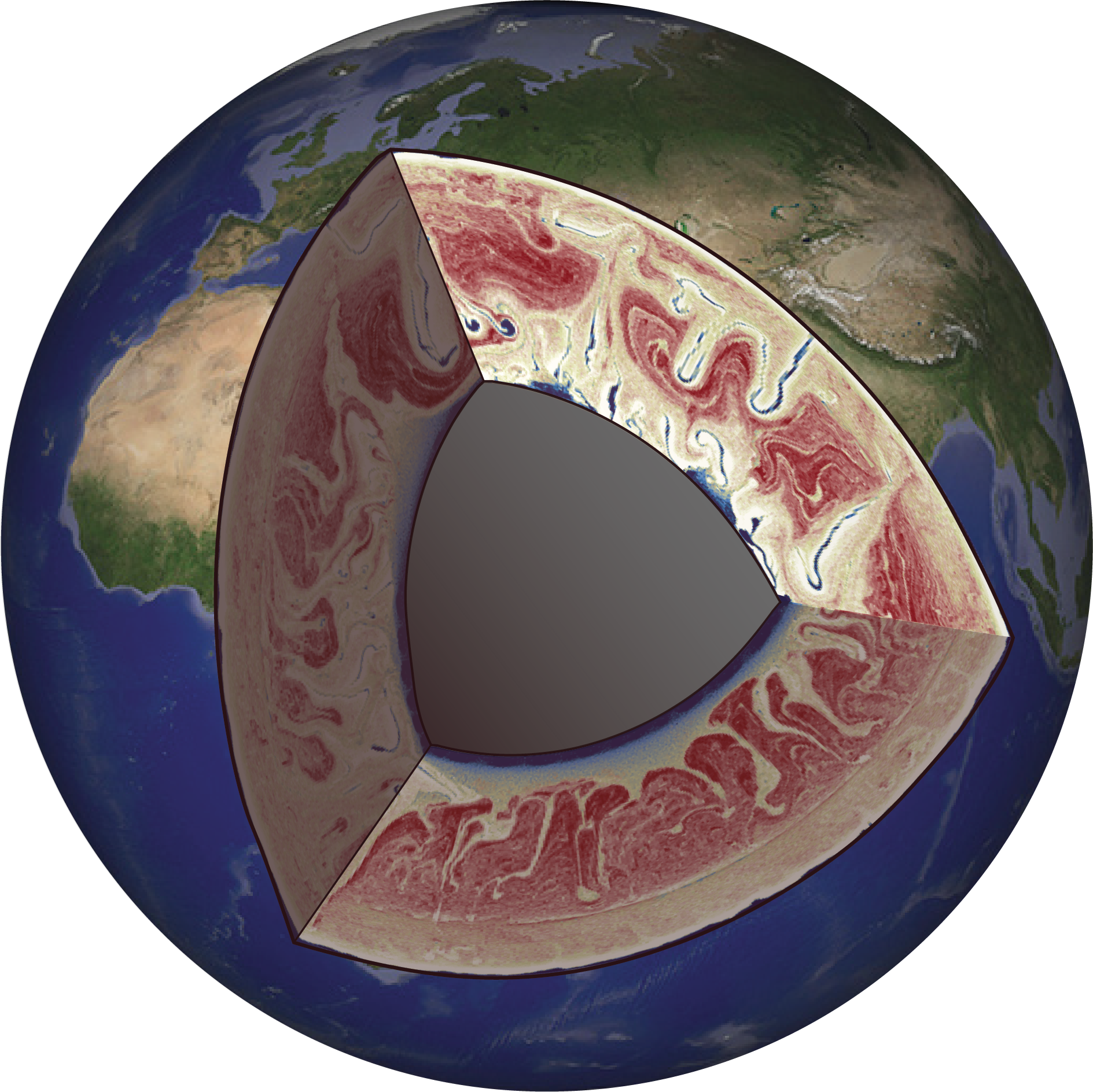
Earth globe with mantle heterogeneity
Earth globe with a mosaic of numerical modelling results from my PhD research (Gülcher et al., 2021, Solid Earth). Red colours represent ancient, primordial materials whereas blue colours represent recycled materials that have entered the deep Earth through tectonic processes.
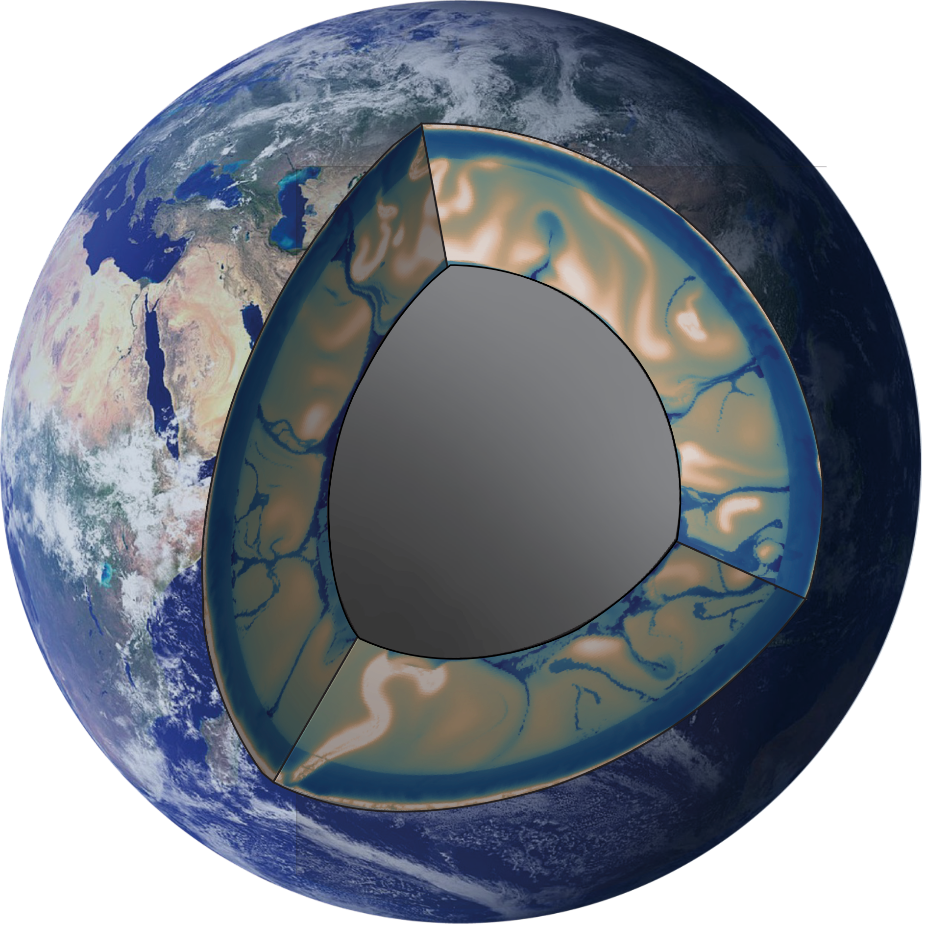
Earth globe with mantle viscosity field
Earth globe with a mosaic of numerical modelling results from Gülcher et al. (2022, G-cubed). The interior mantle field shows viscosity from low (dark blue) to high (white).
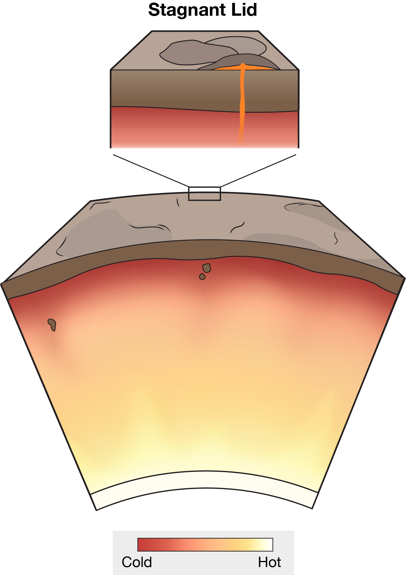
Stagnant lid regime
Conceptual illustration of the "Stagnant lid" mantle and tectonic regime. A planet in “stagnant-lid” regime is covered by a single plate, without any plate boundaries and little to no surface motion. Today, this is likely the case for Mars. Image published in Rolf et al. (2022, Space Sci. Rev.); high-quality image available on S-ink.org.
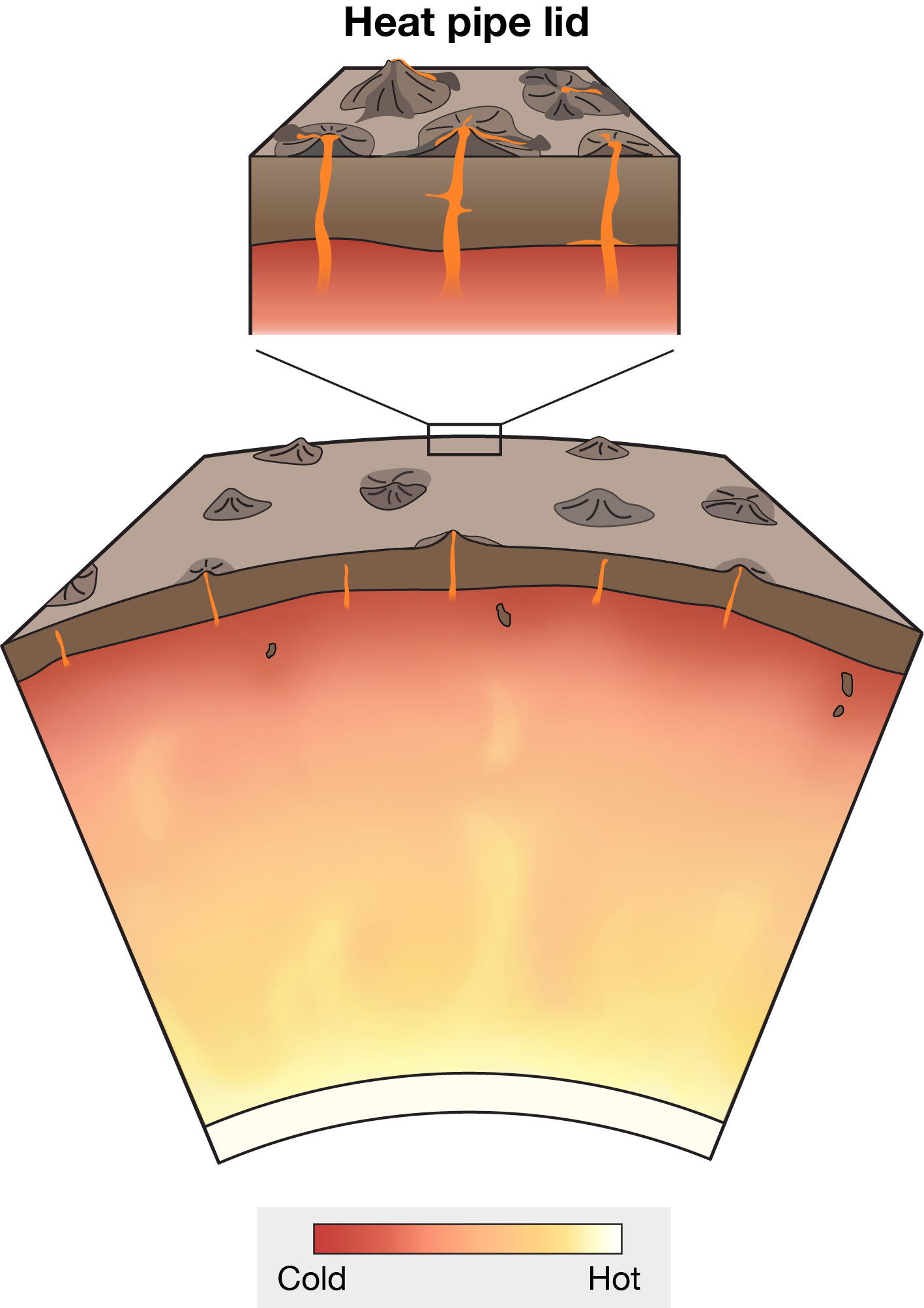
Heat-pipe lid regime
Conceptual illustration of the "Heat-pipe lid" mantle and tectonic regime. A planet evolving in a “heat-pipe” regime, such as Jupiter’s moon Io, is characterised by vertical channels through the lithosphere through which magma erupts to the surface in the form of volcanism. Image published in Rolf et al. (2022, Space Sci. Rev.); high-quality image available on S-ink.org.
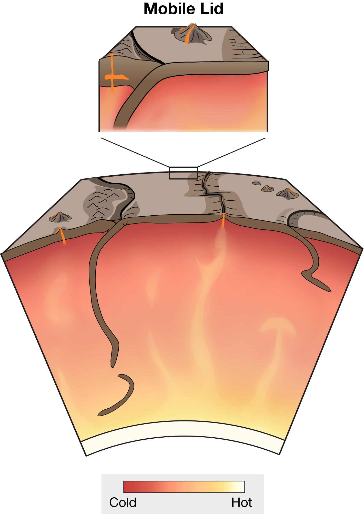
Mobile lid regime
Conceptual illustration of the "Mobile lid" mantle and tectonic regime. In a “mobile lid” style planet, the multiple cold surface plates are continuously in motion, often with differing (usually higher) velocities than the mantle below. Earth’s ocean-plate tectonics is a subcategory of such a mobile-lid regime, marked by narrow plate boundaries at which plates are either created or recycled back into the mantle. Image published in Rolf et al. (2022, Space Sci. Rev.); high-quality image available on S-ink.org.
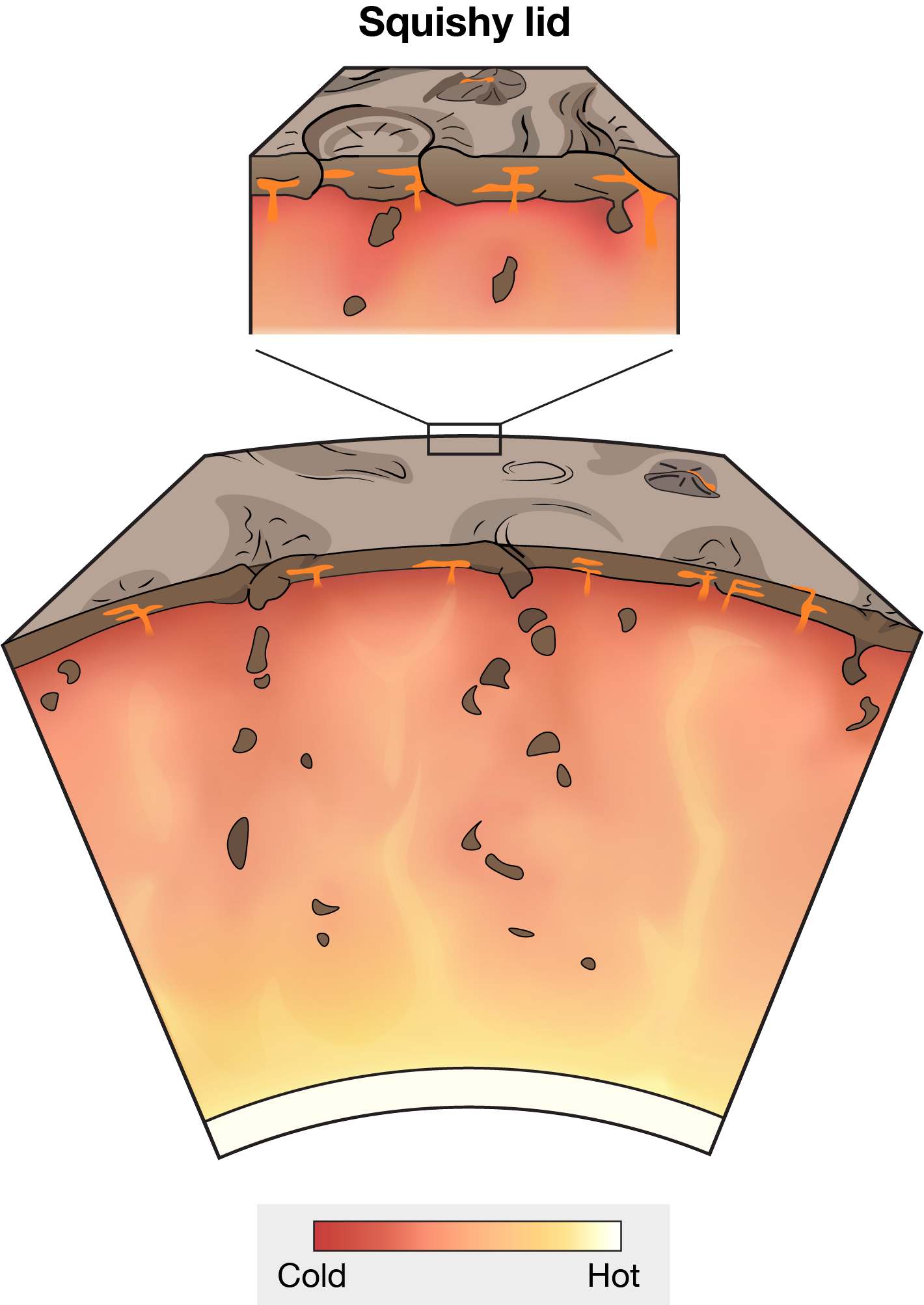
Squishy lid regime
Conceptual illustration of the "Squishy lid" mantle and tectonic regime. The “squishy-lid” regime is characterised by a strong surface plate that is regionally weakened and deformed by intrusive magmatism. Venus is commonly considered to be in a squishy-lid mantle regime. Image published in Rolf et al. (2022, Space Sci. Rev.); high-quality image available on S-ink.org.
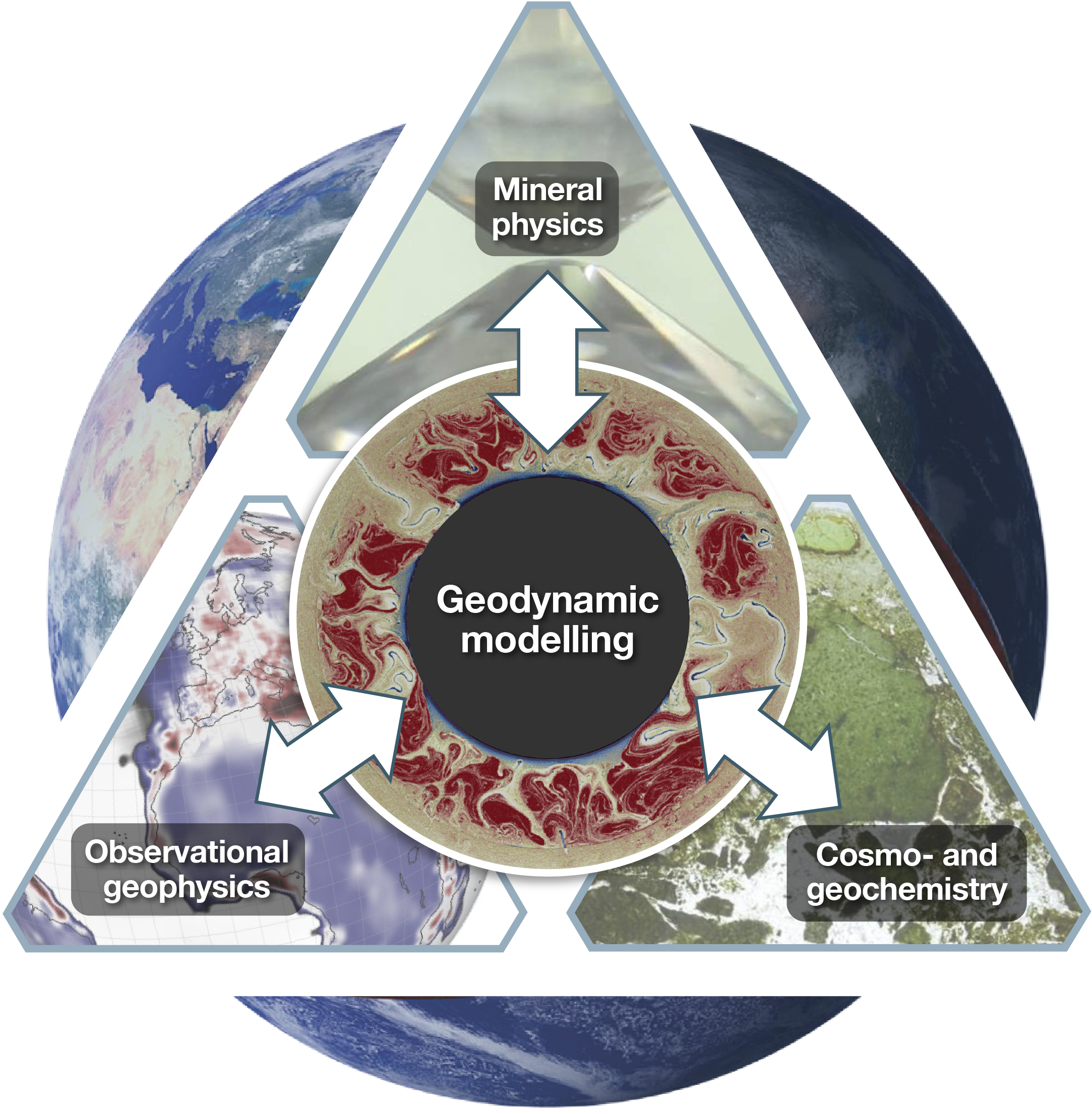
Geodynamic modeling
Geodynamic modeling tools are a useful tool to integrate observations on Earth’s interior and surface, and put them in a coherent, physics-based framework. Such observations and theories come from e.g. observational geophysics, mineral- and rock physics, and cosmo- and geochemistry.
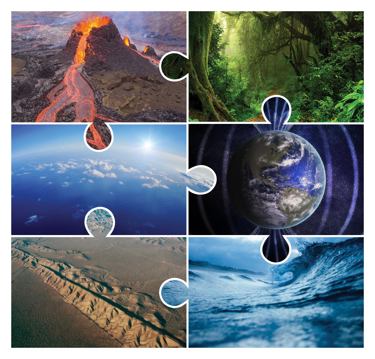
Interconnected processes
System Earth is a combined of interconnected processes. Mantle convection is a key aspect within this system, affecting e.g., Earth's surface geology, atmosphere, liquid water, magnetic field, and volcanism.
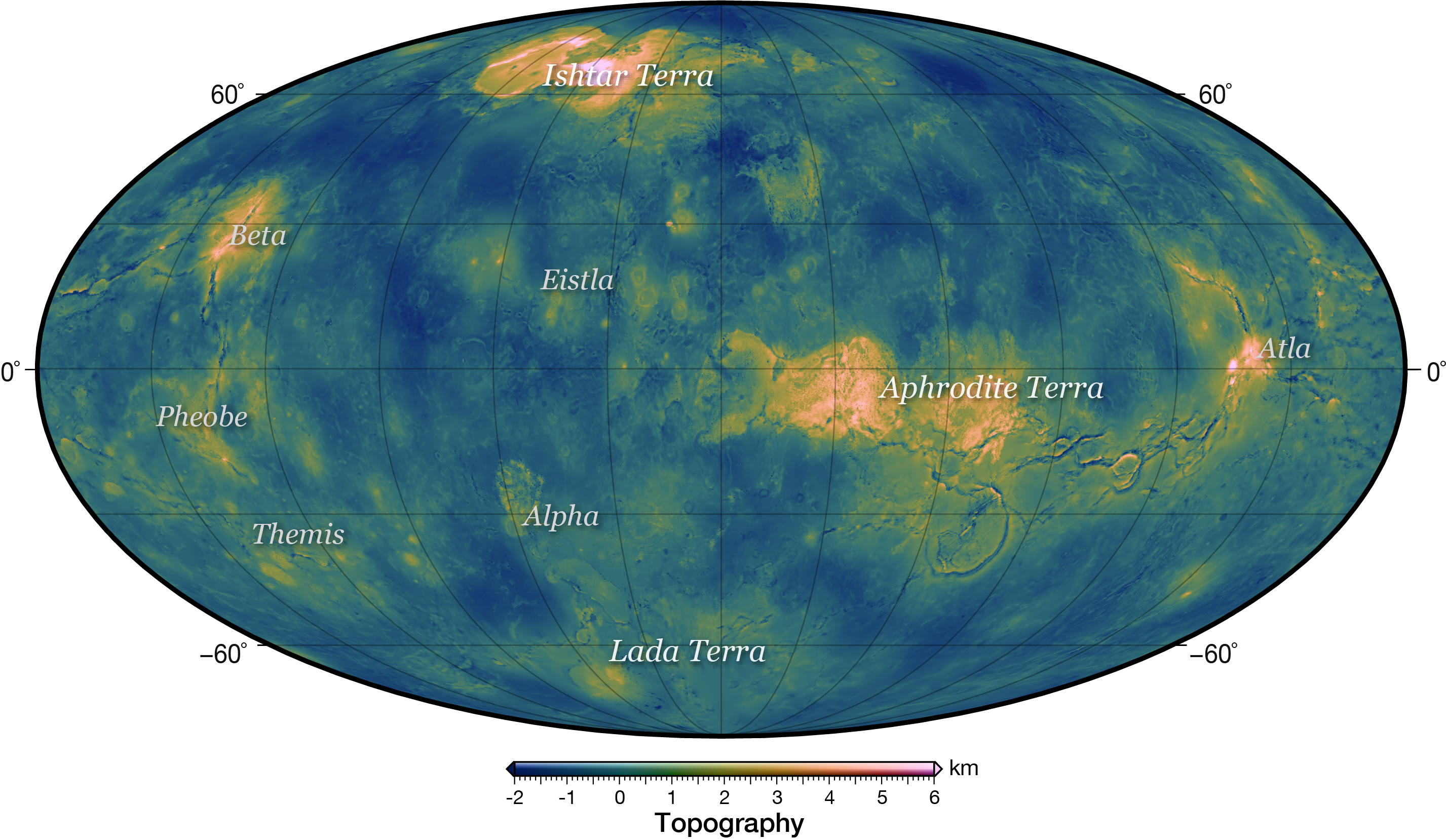
Venus topography
Map of Venus' topography with a Mollweide projection centered at 120°E. The global topography (Pettengill et al., 1992) is relative to 6051.877 km. Figure used in Gülcher et al. (2020, Nat. Goesc.).
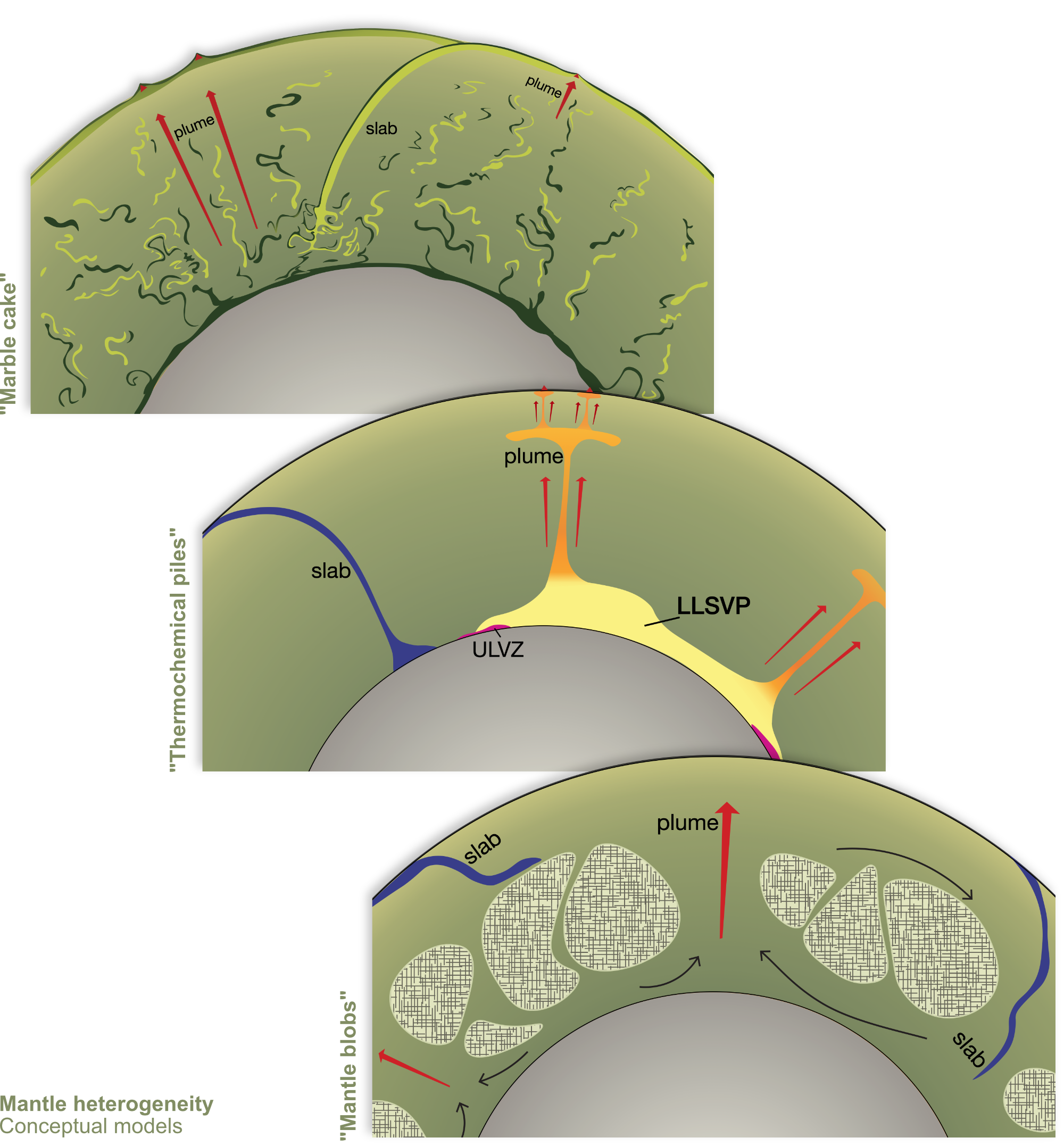
Earth’s mantle heterogeneity theories
Conceptual model sketches for proposed compositional structures of Earth’s mantle. High-res images available on S-ink.org. Adaption from figure published in Gülcher et al. (2021, Solid Earth).
Earth's mantle heterogeneity I
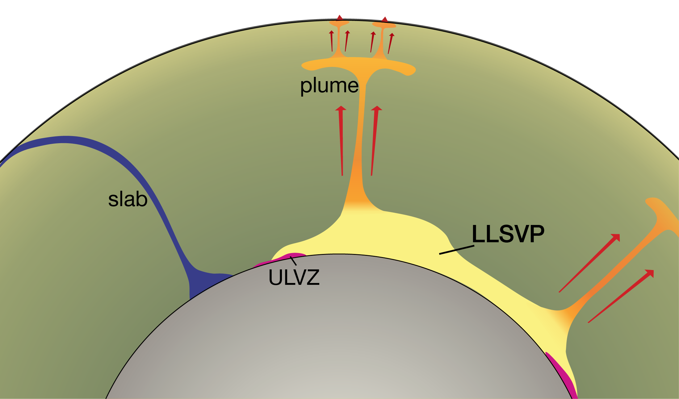
The “Thermo-chemical piles” theory suggests that intrinsically dense materials may accumulate as piles atop the core–mantle boundary. In particular, the two large low-shear velocity provinces (LLSVPs) in the deep Earth are commonly thought to have resisted mantle mixing due to their thermochemical origin. Figure used in Gülcher et al. (2021, Solid Earth).
Earth's mantle heterogeneity II
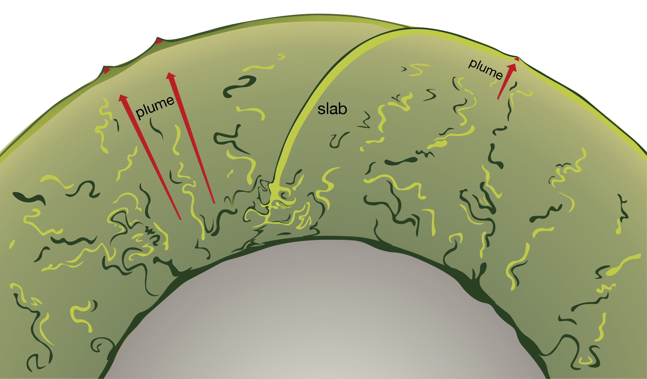
The “Marble cake” theory emphasises that much of Earth’s mantle is made out of recycled oceanic lithosphere (dark and light) slivers that are preserved throughout the mantle. Figure used in Gülcher et al. (2021, Solid Earth).
Earth's mantle heterogeneity III
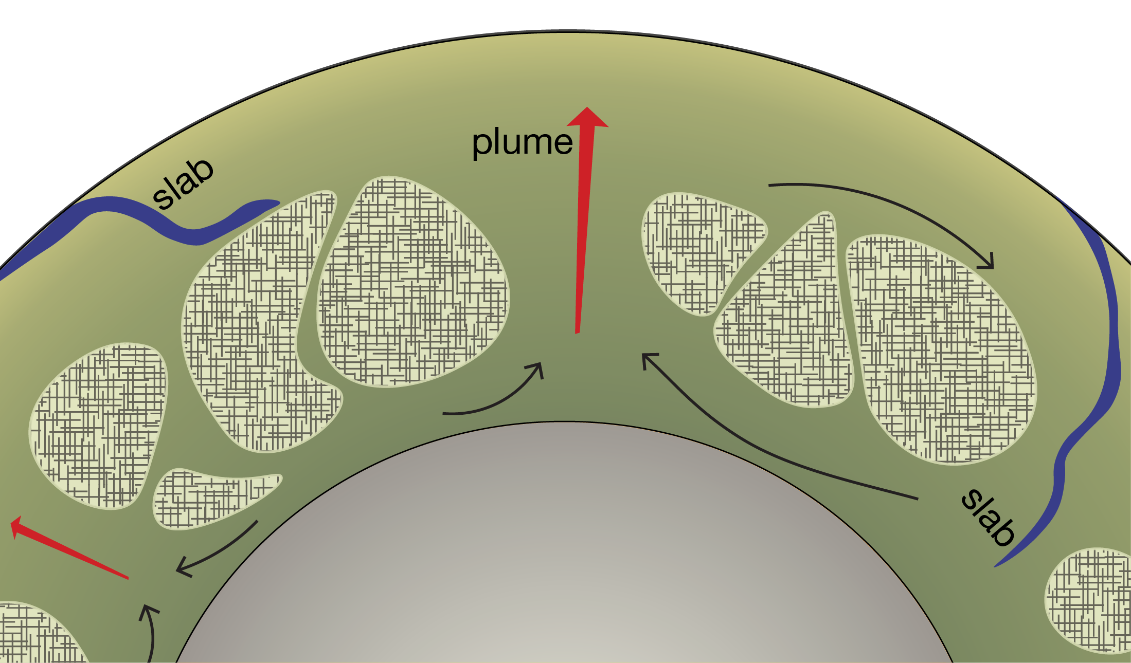
The “mid-mantle blobs” theory emphasises large, compositionally-different domains that may be located in the mid-mantle of the Earth, with mantle convection being accommodated around them. Figure used in Gülcher et al. (2021, Solid Earth).
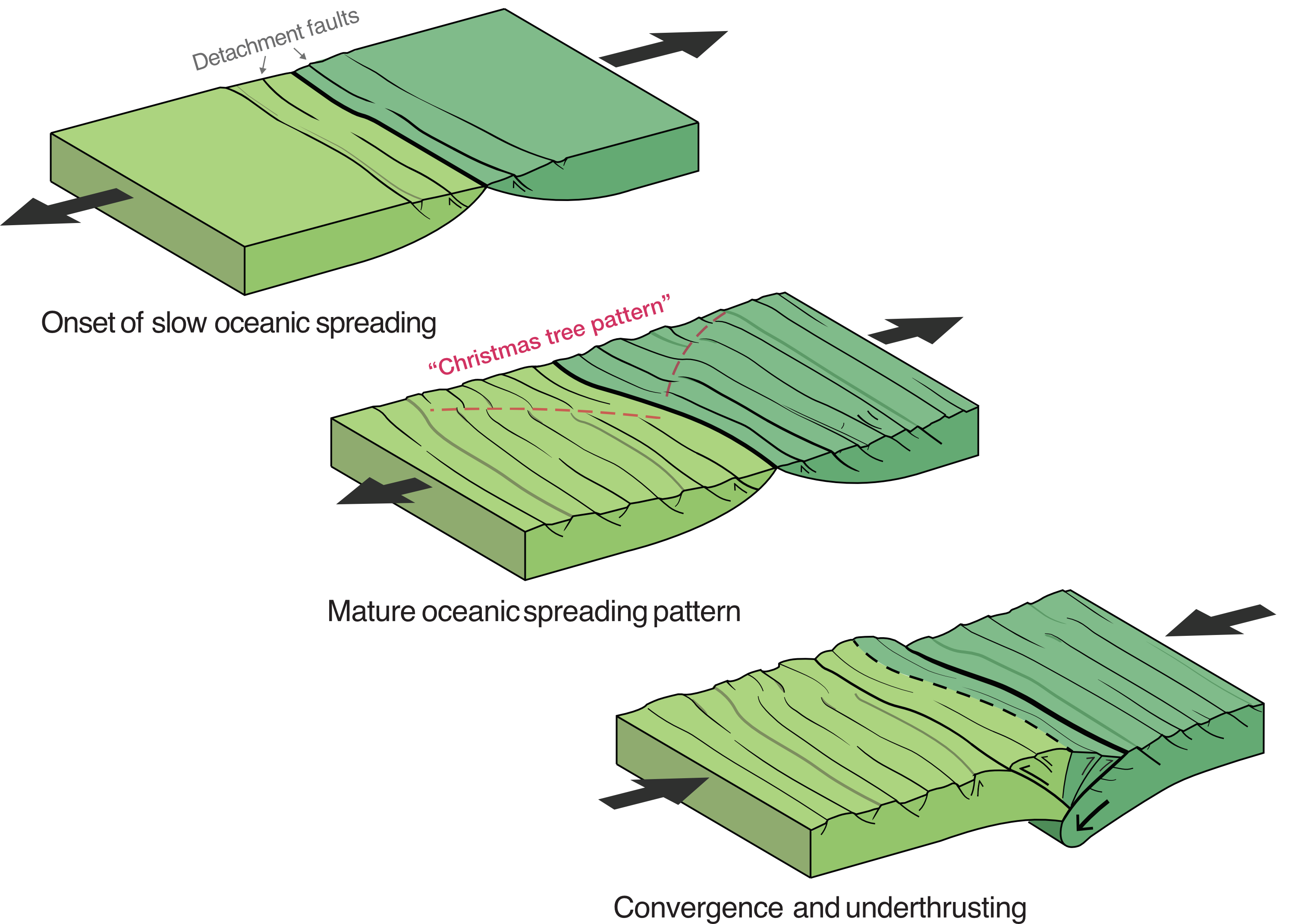
Slow oceanic spreading and subsequent convergence
Graphical abstract for Gülcher et al. (2019, Earth and Planet. Sci. Letters). Three-stage evolution of slow oceanic spreading, with the formation of detachment faults and the "Christmas tree pattern", and subsequent convergence and underthrusting.
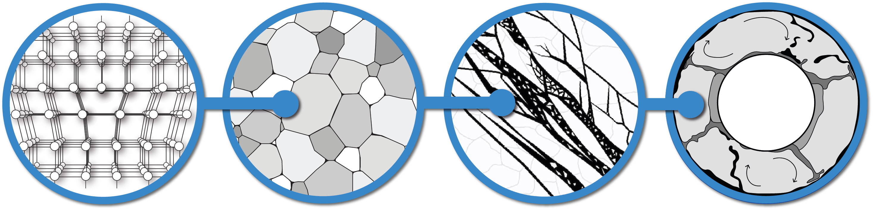
Interconnection of processes affecting mantle convection
Interconnection of processes acting on various spatio-temporal scales, ultimately affecting global-scale mantle convection (right). Shear zone image (second from right) from Fossen and Cavalcante (2017); mantle convection image (rigth) modified from Crameri (2017).